Project: Album A Month — A look into some all-time-favorite albums with redesigned art-direction.
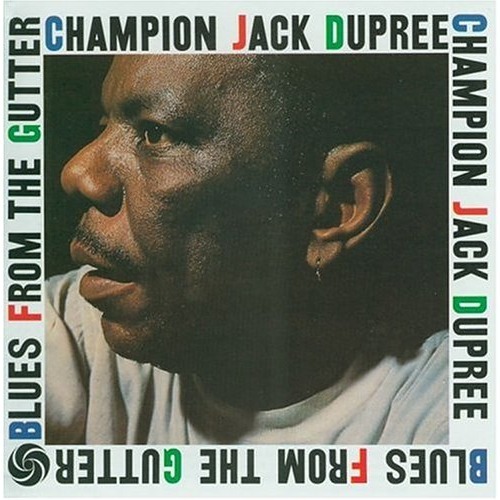
I can't think of a better place to start this project than with the sultry howls and dancing keys of piano-blues legend Champion Jack Dupree. I'll be exploring his first 12" LP: Blues From The Gutter.
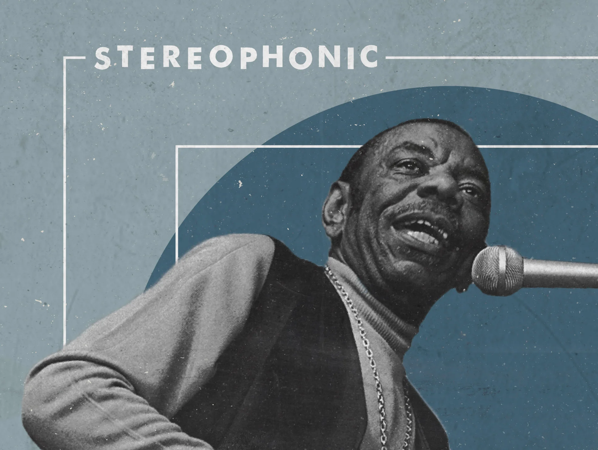
Redesigned art:
Original Art:
More on my art direction after some context...
BACKGROUND
Born on July 4th of 1910 in New Orleans, Dupree was raised in Colored Waifs' Home for Boys after tragically losing his parents to a house fire. Coincidentally enough, Louis Armstrong was born into the same NOLA orphanage exactly 10 years prior (July 4th, 1900). After some time playing the streets of New Orleans, barrelhouse piano player and all around rough cat, Drive 'em Down, took Dupree under his wing. Listening and watching club boogie-woogie and slow blues drove Dupree to share his stories through music.
“I got paid $1.50 an hour when I played in a club and I was lucky to get that. When things got very slow, I took to boxing to make a living. I fought off and on throughout the 30s, and was fairly successful at it. Incidentally, that’s how I came to be called ‘Champion’ Jack Dupree.”
Fighting brought Dupree north and through the move he continued playing as he could, cutting 20+ records for various labels. He ultimately lost his wife in Chicago and moved to New York where he found his most prominent success after signing with King Records, which was based in Ohio.
All the while, Dupree coped with his incredible losses 'getting loaded' with 'the needle', 'cocaine', 'reefer', and various other crutches (Junkers Blues). At this time smoking weed was a 'habit' that wasn't illegal, but his junker status is explained in full swing in Can't Kick the Habit as he sings: "It don't pay nobody to live their life so fast. This dope is killin' me."
WHY I LOVE THIS ALBUM
While piano-based blues frequently takes a backseat to it's more popular guitar-based counterpart, this album is a shining glimpse into humanity and what it was like to live through the great depression and world wars. Through his incredible story, Dupree has managed to straddle the fine line between comical and serious interpretations of what it was like to be Southern rural farmhand and also an urban barrelhouse Negro.
“Jack Dupree is a quiet, observant man who gives an immediate impession of patience, poise, and inner strength. He has seen more than his share of the seamy side of life, and with the integrity of the true artist he pictures and interperets what he has seen without moralizing on it.”
The sorrows (the death of his parents and wife) Dupree has faced are astounding. He has literally fought (as a boxer) to pay his bills and support his musical career. His drive, despite having meandering views on whether narcotic addiction is good or bad, is an attempt to justify those who have a 'habit'. He fights to convince the listener that no one should fully disregard another person's human experience, no matter how filthy the past. The sounds of this album give us insight into the realities of his personal 'gutter blues', and inevitably suggests us to sympathize with him through our own struggles of varying magnitude.
If I had to pick one single, Evil Woman is my favorite track from this album. I mean what's not to love? The saxophone call-and-response to his vocals - the Johnny B Goode influenced guitar solo (released same year, 1958) - the dancing piano licks - the light and lively drum brushing - the various 'oh yeah!, what!' outbursts put you right in the studio with them all... The whole song is slow blues at it's finest.
Grab a drink of your choice and listen to this whole album. It'll immediately bring you to another time and place. My vinyl copy is a steadfast classic to my collection and is a favorite to pull out after dinner on a Friday night staying in.
MY VISION
I knew I had to go the 'classic' look for this album. The focus of Dupree's story in the album pushed me to focus the art on him as well, rather than going for an illustration or vector art. I decided that an emotive shot of Dupree (rather than simply the side of his face like the release), his name, the album title, the album being in stereo, and the release year were the most important pieces to showcase. So I started my research: I scoured the internet for vintage vinyl covers and thumbed through my personal collection and below are a few vinyls I took inspiration from: Lou Rawls & Les McCann, Stormy Monday | Otis Redding - Otis Blue: Otis Redding Sings Soul
Vintage design often features VERY bold san serifs. Art directors wanted you to be able to read the title on a shelf across the record store. Pictures were often also stripped down to two tones: black and a color. For the blues genre, I had to go with blue and I kept with the simple geometric shapes and san serif fonts. To really make 'BLUES' pop, I used italics and made the top of the 'S' curl over into the circle where Dupree sits at his piano.
For the year numerals, I wanted to introduce a third font and I went through countless number sets from elegant, ornamental letterforms to stencil brushes. I decided to thumb through some of my old type specimen books and found a simple, but snappy san serif (right page above). I loved that the numerals had ascenders and descenders (they varied in height), so the final '8' stands out and gives it emphasis over the rest of the year.
While the layout I chose doesn't give an immediately simple read, I wanted the info to sort of dance around him. The angles of the text and shapes lead your eye across the cover effectively enough to have everything make sense. The angle of his arm in particular leads you from the beginning of the title (BLUES) through to the end (FROM THE GUTTER). I wanted him to have movement also, so I cropped him in a way that makes him look like he's climbing out of his bounding circular hole. The two color scheme fits the time period (it would be cheap to screen print), and the white boxes are added to give a sense of grid. I also had a little fun and staggered the letters in stereo phonic as a play on the word, which means the audio has distinct left and right channels. The microphone parallels the change in color, and his image actually features a piano, which was absent on the original release.
Last step: texture. Make it feel right at home with the rest of the records from 1958. Ruining brand new, perfect designs is one of my favorite parts. The worn, handmade feeling gives it more life and personality. Above are before and after shots.
For the vinyl label, I created a monogram for his initials: CJD. I initially wanted to use this as a stamp or embossed pressing in one of the corners of the cover, but decided to scratch that idea for simplicity. If this were to go into production the track listings and copyright information would circle the rim in a simple san serif text.
“A designer knows he has achieved perfection not when there is nothing left to add, but when there is nothing left to take away.”
Thanks for checking my thoughts and process out if you've made it this far! More will be coming. Below are a few last close-ups. See you next month!


